Structural social conditions
Poverty, school non-attendance, educational delay, child labour and economic dependency.
Analysis of Internal Conflict
School of Social, Political and International Studies
Universidad del Rosario
Causality, association and evidence
Mathew H. Charles, PhD
Use ↓, → or the controls to move through the presentation
Begin with the question
Is the recruitment of children and teenagers more closely associated with:
Poverty, school non-attendance, educational delay, child labour and economic dependency.
Armed-group presence and rivalry, displacement, coca cultivation, targeted murders and territorial violence.
From question to expectation
A hypothesis is simply the answer we expect before looking at the results. The analysis then checks whether the observed pattern supports it.
Municipal differences in recruitment will be more strongly related to armed-group presence, territorial competition, displacement and conflict-related violence than to poverty and educational disadvantage alone.
It records whether groups are present in the same municipality. It does not record whether they were fighting each other. Co-presence can therefore suggest possible rivalry, but it is not the same as a direct rivalry measure.
Descriptive statistics
Descriptive statistics tell us what the dataset contains before we test relationships.
Important: zero means “no documented case in this dataset,” not “recruitment did not occur.”
Spatial description
Maps reveal clusters, but they do not explain why those clusters exist.
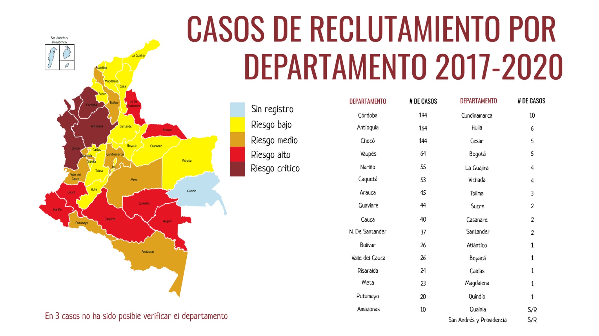
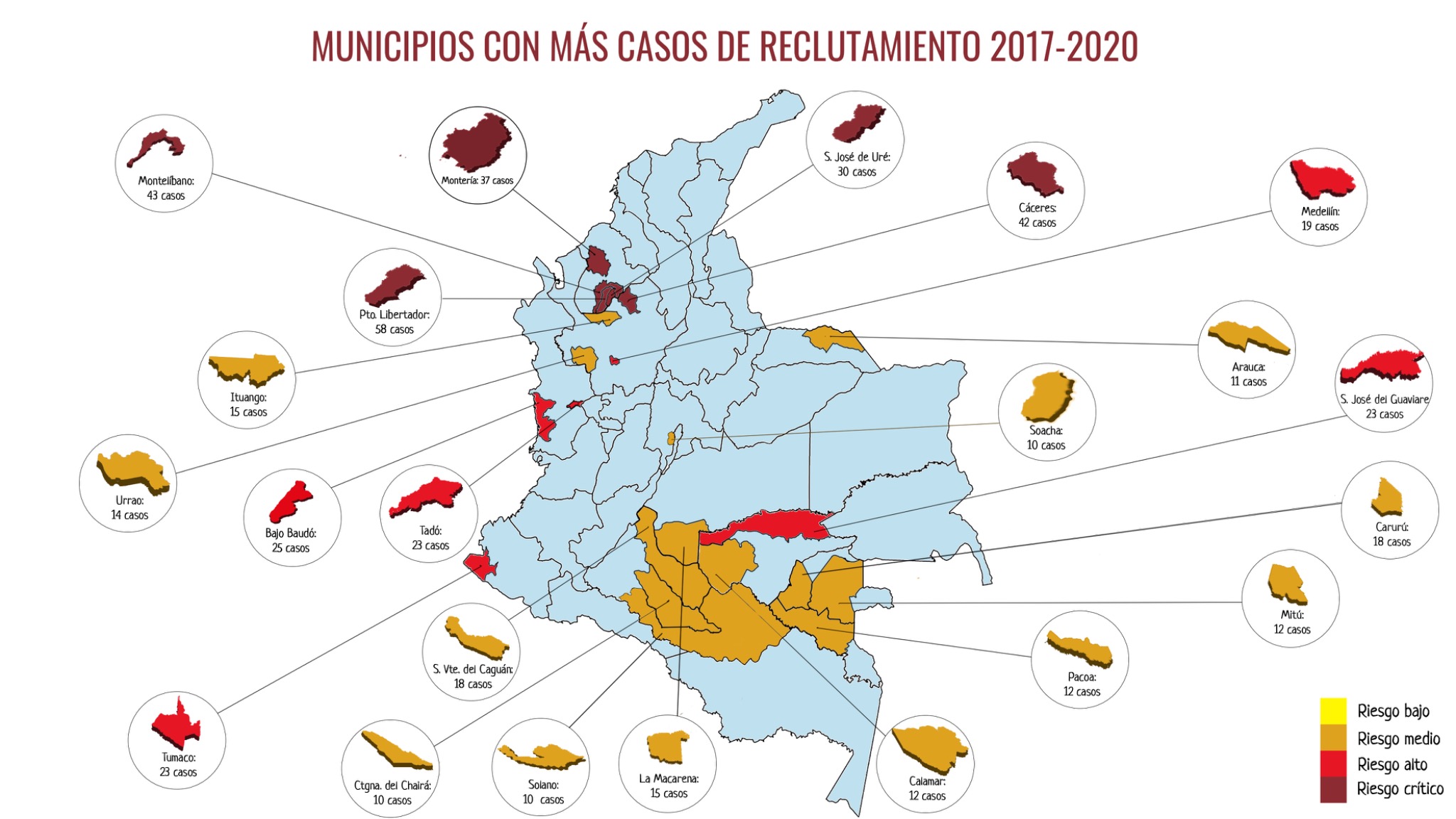
Original descriptive graphics supplied with the dataset; integrated here as evidence, not treated as a causal model.
Raw counts
Counts identify where the largest number of cases was documented.
Do not confuse volume with individual risk: a larger department or youth population can generate more cases even when its rate is lower.
Local concentration
Choosing the outcome
A rate makes municipalities with different youth populations more comparable.
The answer estimates how many documented cases there are for every 10,000 young people.
Interpretation: Municipality A has more cases, but Municipality B has the higher recruitment rate relative to its youth population.
From one municipality to a group
Mean simply means average. Imagine that three municipalities belong to the same armed-actor category.
What this tells us: 3 is one summary number for the group.
What it does not tell us: Municipality A still has a rate of 1 and Municipality C still has a rate of 5.
Two ways to summarize a group
We use both because recruitment rates contain many zeros and a small number of very high values.
The very high value of 18 pulls the mean upward.
After ordering the five rates, the third—or middle—value is 0.
Mean: uses every value and captures the overall level, but can be pulled upward by a few extreme municipalities.
Median: describes the middle municipality and is less affected by extremes, but can remain zero when fewer than half of municipalities record recruitment.
How to read the later table: when the mean is much higher than the median, a few high-rate municipalities are raising the average. That is why showing both is useful.
Conflict dynamics
The bars show the mean of the available municipal recruitment rates; the percentages show how many municipalities record any recruitment.
2.8% recruitment-positive
51 cases · mean uses 668 municipal rates14.6% recruitment-positive
243 cases · mean uses 301 municipal rates57.6% recruitment-positive
434 cases · mean uses 99 municipal rates71.9% recruitment-positive
100 cases · mean uses 32 municipal ratesComposition matters
Mean shows the average rate; median shows the middle municipality. A large gap warns us that a few high-rate municipalities are pulling up the average.
| Recorded actor combination | Municipalities | Recruitment-positive | Cases | Mean rate (average) | Median rate (middle) |
|---|---|---|---|---|---|
| Dissident FARC + Paramilitary successor | 43 | 51.2% | 217 | 5.09 | 0.49 |
| Dissident FARC | 44 | 38.6% | 113 | 4.38 | 0.00 |
| ELN + Paramilitary successor | 43 | 62.8% | 155 | 3.68 | 0.74 |
| Dissident FARC + ELN | 13 | 61.5% | 62 | 2.63 | 1.83 |
| Dissident FARC + ELN + Paramilitary successor | 32 | 71.9% | 100 | 2.37 | 1.28 |
| ELN | 40 | 12.5% | 18 | 0.61 | 0.00 |
| Paramilitary successor | 218 | 10.1% | 112 | 0.23 | 0.00 |
| No recorded actor family | 687 | 2.8% | 51 | 0.12 | 0.00 |
Co-presence is a proxy: it tells us that actor families overlap territorially. It does not tell us whether they were actively fighting, cooperating or operating in different parts of the municipality.
Rearmed FARC
371 cases across 1012 municipalities
119 cases across 59 municipalities
338 cases across 49 municipalities
Municipalities recording rearmed-FARC presence contain 338 cases, but the separate attribution file assigns many cases in those territories to the AGC or leaves the actor unknown. Rearmed-FARC presence may be marking contested territories rather than recruitment committed by one actor.
Reported perpetrator
Only cautiously: 43.3% of the actor-attribution file is coded as unknown.
The largest category is missing attribution. Therefore, the ranking of identified actors is incomplete.
Data audit: this file contains 818 recruitment cases and its actor columns sum to 815, while the enhanced universe contains 828. Use the actor ranking as preliminary descriptive evidence until the source versions are reconciled.
Before the scatterplot
A correlation coefficient is one number that summarizes how two variables vary together across municipalities.
A variable is something that can differ from one municipality to another—for example, recruitment rate, displacement or poverty.
The coefficient asks: when one variable is higher, does the other usually tend to be higher, lower or show no clear pattern?
+ means higher values of one variable tend to accompany higher values of the other. − means higher values of one tend to accompany lower values of the other.
Look at the distance from 0. A number near 0 is weak. A number nearer 1—positive or negative—is stronger.
This means a moderate positive association. It is not 54%, and it does not say how many extra cases one factor produces.
What the symbol means: rₛ is the Spearman correlation coefficient. It describes an association, not causation.
Now see the pattern
The coefficient summarizes the relationship in one number. The scatterplot shows the municipal observations behind that number.
Conflict dynamics
Choose one variable at a time. Recruitment per 10,000 always remains on the vertical axis so the graphs can be compared.
The dots form four vertical stacks because the X variable can only be 0, 1, 2 or 3. Recruitment-positive municipalities rise from 2% with no recorded actor family to 15% with one, 58% with two and 72% with three.
A clear positive association between armed-actor overlap and recruitment. The stacks show categories, not a smooth continuous increase.
For 0/1 presence indicators: the two vertical bands mean “absent” and “present”; their difference is easier to read as a comparison of group means. Multiple presence measures territorial overlap, not observed rivalry or combat.
Social conditions
Look first at the direction and spread of the dots. Do not decide that a relationship is strong simply because the line slopes upward.
Dots with zero recruitment appear across the entire poverty range, so poverty alone does not separate municipalities neatly. Even so, recruitment is documented in 27% of the highest-poverty quarter, compared with 7% of the lowest-poverty quarter.
A weak positive association: poverty may contribute to vulnerability, but it does not by itself explain where recruitment is documented.
Illicit economies
Coca cultivation and drug seizures are not the same type of indicator. Seizures may reflect trafficking, policing or reporting, so interpret them carefully.
Most municipalities record no coca cultivation, forming a dense left-hand stack. Recruitment appears in 46% of coca-growing municipalities versus 5% of non-coca municipalities, while a few very large cultivation values stretch the axis.
A moderate positive association, consistent with illicit territorial economies forming part of the conflict environment.
Let the software do the calculation
You do not need to calculate the formula by hand. SPSS calculates it; your job is to choose the correct variables and interpret the output.
Reading the SPSS output
The table looks complicated because it repeats information. We only need the cells where the two different variables cross.
| Multiple armed-group presence | Recruitment rate | ||
|---|---|---|---|
| Multiple armed-group presence | Correlation Coefficient | 1.000 | 0.539** |
| Sig. (2-tailed) | — | < 0.001 | |
| N | 1100 | 1100 | |
| Recruitment rate | Correlation Coefficient | 0.539** | 1.000 |
| Sig. (2-tailed) | < 0.001 | — | |
| N | 1100 | 1100 |
** Correlation is significant at the 0.01 level (2-tailed).
A variable always correlates perfectly with itself. These diagonal cells do not answer our research question.
Read the yellow cells: Multiple armed-group presence × Recruitment rate.
+0.539 appears in the top-right and bottom-left because the same relationship is shown in both directions.
Coefficient, Sig. (2-tailed), and N each answer a different question. The next slide explains them.
Reading each element
Read from top to bottom. Do not interpret one line without the others.
Question answered: What is the direction and strength?
The plus sign means a positive direction. The size, 0.539, indicates a moderate relationship. It is not 53.9% and not a predicted number of cases.
Question answered: Is the pattern unlikely to be a chance result if there were no relationship?
This is the p-value. Below 0.05 is conventionally called statistically significant. “2-tailed” means SPSS checked for either a positive or a negative relationship.
Question answered: How many observations were compared?
Here N means municipalities with usable values for both variables. It is not the number of recruitment cases. Municipalities missing either value are excluded.
Worked example 1
Multiple armed-group presence and recruitment per 10,000.
| Multiple armed-group presence | Recruitment rate | ||
|---|---|---|---|
| Multiple armed-group presence | Correlation Coefficient | 1.000 | 0.539** |
| Sig. (2-tailed) | — | < 0.001 | |
| N | 1100 | 1100 |
** Correlation is significant at the 0.01 level (2-tailed).
Positive. Municipalities with multiple armed groups tend to have higher recruitment rates.
0.539 is moderate. It is not perfect, but it is one of the strongest relationships in this dataset.
p < 0.001. This is below 0.05, so we describe the relationship as statistically significant.
The result supports the conflict-dynamics hypothesis. It does not prove that rivalry caused recruitment.
Worked example 2
Heroin seizures and recruitment per 10,000.
| Heroin seizures | Recruitment rate | ||
|---|---|---|---|
| Heroin seizures | Correlation Coefficient | 1.000 | 0.043 |
| Sig. (2-tailed) | — | 0.158 | |
| N | 1100 | 1100 |
The sign is positive, but the coefficient is extremely close to zero.
0.043 is very weak. The municipalities do not form a clear upward or downward pattern.
p = 0.158. This is above 0.05, so the result is not statistically significant.
This dataset provides no clear evidence of a relationship between heroin seizures and recruitment. That is not the same as proving that no relationship can ever exist.
Return to the research question
Now that we know how to read a coefficient, we can compare the results. Longer bars mean stronger positive associations with recruitment per 10,000.
Tempering the argument
Where and how often does recruitment appear?
Which factors systematically occur alongside it?
What plausible mechanism links the factors?
Would recruitment have differed without the factor?
Appropriate conclusion: “The evidence is consistent with conflict dynamics playing a stronger role.” Not: “The data prove conflict caused recruitment.”
From pattern to explanation
The numbers show where an expected pattern appears—and where it does not. Interviews and documents can then investigate how and why.
How did conflict exposure lead to recruitment?
What interrupted or prevented recruitment?
What explanation are we missing?
What distinguishes this context?
Quantitative data: identifies the pattern and selects contrasting municipalities.
Qualitative data: interviews, early warnings and local documents trace mechanisms, protection and missing explanations.
Strengthening causal claims
We cannot force cross-sectional data to prove causation. We improve the research design.
Show that rivalry or actor entry occurred before recruitment increased.
Compare changes within the same municipality from 2017 to 2020.
Consider poverty, education, population, coca and displacement together.
Compare similar municipalities that differ in actor competition.
Use alerts and interviews to identify how rivalry creates pressure to recruit.
Distinguish co-presence from explicit territorial contestation.
Mixed-methods bridge: the quantitative analysis identifies the pattern; qualitative evidence investigates the mechanism and tests whether the causal story is credible.
Measurement and missing cases
Correct language: this indicates an official-registration gap. It is not a definitive estimate of all unreported recruitment.
Case comparison
| Municipality | Department | Broader count | Official count | Numerical share |
|---|---|---|---|---|
| Puerto Libertador | Córdoba | 58 | 0 | 0.0% |
| Montelíbano | Córdoba | 43 | 0 | 0.0% |
| San José de Uré | Córdoba | 30 | 0 | 0.0% |
| Carurú | Vaupés | 18 | 0 | 0.0% |
| Mitú | Vaupés | 12 | 0 | 0.0% |
| Soacha | Cundinamarca | 10 | 0 | 0.0% |
| Arauca | Arauca | 11 | 7 | 63.6% |
| Tame | Arauca | 7 | 4 | 57.1% |
| Puerto Rico | Caquetá | 8 | 8 | 100.0% |
Interpretation exercise
Session synthesis
Start with a clear research question and hypotheses.
Describe the outcome before testing explanations: counts and rates answer different questions.
Read scatterplots through axes, dots, direction, strength and outliers—not only the coefficient.
Conflict dynamics show the stronger preliminary associations, especially multiple armed-actor presence.
Association narrows the argument; causal claims require time, comparison, controls and qualitative evidence.
Analysis of Internal Conflict · Universidad del Rosario · Mathew H. Charles, PhD